
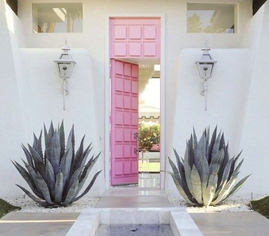
With Spring in the air, everything just looks so damn pretty, doesn't it? And a colour that seems to be popping up a lot lately is pink. I'm not a big fan of "pretty", however pink has been on my radar for a little while now. I like the unexpected pop on surfaces and designs you wouldn't normally associate with pink, such as concrete and warm metals like copper and bronze. And check out those pink doors! I'm especially loving it in pale blushes on walls and paired with either navy/indigo or with ecru and blonde timbers. I think the trick with pink is to avoid the bubblegum tones and either go with a loud, bold pop like a watermelon or hot pink or choose a softer, "dirtier" shade with a hint of black. Check out Dulux's Pink Marble for a soft muted salmon pink that would suit a Scandi style interior. Try to avoid the sugary pinks that can make a room look like a little girl's nursery. In fact, I'd avoid those even for a nursery! Choosing just the right tone can make a space look either soft and feminine or cool and edgy.
 |
| Betsey Johnson's house |
 |
| Nord Autumn Winter 2012 catalogue |
 |
| Vtwonen April 2012, styling Marianne Luning, photography Anne de Leeuw vtwonen.nl |
 |
| Interior photography by Derek Swalwell |
 |
| House tour of artist Kirra Jamison featured in Jan/Feb 2013 Inside Out magazine. Styled by Jason Grant, photographed by Derek Swalwell. |
 |
| Arne Jacobsen egg chair. Photo source unknown. |
 |
| Vtwonen April 2012 |
 |
| Dulux paint, Pink Marble. Also try in half or quarter strength. |
All images are credited where possible. Please feel free to share information on any where a source could not be located.
Inside Scoop. Interior Design Blog.


No comments:
Post a Comment