Monday, 6 April 2015

MARSALA - PANTONE COLOUR OF 2015

By HAO Design - Taiwan part hair salon and part home (via +yellowtrace )
This is a post I've wanted to feature for a little while but I've been MIA lately dealing with some personal issues. Back in full swing now, though, so better a little late than never, I suppose. For those of you in the know, Pantone, the international authority on colour, recently announced its choice for 2015. Marsala is just as the name suggests - a robust and earthy wine red, and I'm right on board! I absolutely love it on lips and in fashion but I'll admit I was initially a little worried about its use in interiors. It probably didn't help that it was announced during our Summer and I just couldn't connect with it at the time. It's such a warming and earthy tone, I remember feeling a little weighed down by it. But I must say, those initial reservations were short-lived and I'm absolutely loving it now! It's so damn rich and sexy - that's right, I said sexy! It certainly has the grrrr factor. I particularly like the idea of it in velvet and leather (again, very sexy) and paired with deep blues and greys. I think I might have written about my aversion to red in a previous post, but this is a sophisticated red that I definitely approve of. Deep and a little dirty - just up my alley! Can you see it in your space?


Vincenzo De Cotiis, apartment in a 19th century building in Milan (via domainehome.com) 


Hans Agne Jacobsen, glass ceiling light, 1950s (via Pinterest) 
via domainehome.com

Edgy by Kaza Concrete | Hexagonal concrete tiles Designed by Patrycja Domanska and Tanja Lightfoot
Paris Door Photograph via etsy.com


via sadecor.co.za

All images are credited where possible. Please feel free to share information on any where a source could not be located.

Inside Scoop. Interior Design Blog

Friday, 17 October 2014

JUST HANG!


There's something about hammocks and hanging chairs that entice you to chill out, relax and just hang about with not a care in the world. They can magically transport you to a place of complete serenity. With all the stresses in our lives, it's important to factor in chill-out zones in our homes. And while you'd expect to see a hammock or hanging chair out on the deck or by the pool, have you thought about placing one indoors? Pretty freakin' awesome, if you ask me! That's not to say you shouldn't have them outdoors. Go for it! Of course, they're a little trickier to install than opting for a simple armchair - you need to ensure you bolt them to support beams in the ceiling or wall. This is important so you and your ceilings don't come crashing down! But once installed properly, they can provide a fun and playful element to your home. And that can't be a bad thing in my book. There's also a childlike quality to things that hang and swing in the air, encouraging squeals of delight. Coupled with a cocktail in hand, they're the perfect recipe for total bliss.


simplyfabulouschic.com


Image via @byronbayhangingchairs


Styling Cleo Scheulderman, Photography Jeroen van der Spek Hier. vtwonen.nl


All images are credited where possible. Please feel free to share information on any where a source could not be located.

Inside Scoop. Interior Design Blog.

Wednesday, 15 October 2014

PRETTY IN PINK


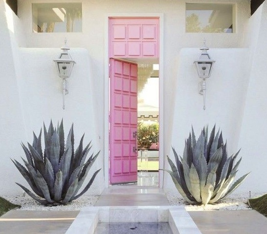
With Spring in the air, everything just looks so damn pretty, doesn't it? And a colour that seems to be popping up a lot lately is pink. I'm not a big fan of "pretty", however pink has been on my radar for a little while now. I like the unexpected pop on surfaces and designs you wouldn't normally associate with pink, such as concrete and warm metals like copper and bronze. And check out those pink doors! I'm especially loving it in pale blushes on walls and paired with either navy/indigo or with ecru and blonde timbers. I think the trick with pink is to avoid the bubblegum tones and either go with a loud, bold pop like a watermelon or hot pink or choose a softer, "dirtier" shade with a hint of black. Check out Dulux's Pink Marble for a soft muted salmon pink that would suit a Scandi style interior. Try to avoid the sugary pinks that can make a room look like a little girl's nursery. In fact, I'd avoid those even for a nursery! Choosing just the right tone can make a space look either soft and feminine or cool and edgy.

vtwonen.nl

Betsey Johnson's house 

Nord Autumn Winter 2012 catalogue


Vtwonen April 2012, styling Marianne Luning, photography Anne de Leeuw vtwonen.nl
Interior photography by Derek Swalwell
House tour of artist Kirra Jamison featured in Jan/Feb 2013 Inside Out magazine. Styled by Jason Grant, photographed by Derek Swalwell.
Designed by Abigail Ahern abigailahern.com

Arne Jacobsen egg chair. Photo source unknown.


Vtwonen April 2012


Dulux paint, Pink Marble. Also try in half or quarter strength.

All images are credited where possible. Please feel free to share information on any where a source could not be located.

Inside Scoop. Interior Design Blog.